- Today I will carry on with creating my website
- I will hopefully take part in and receive peer assessment as well self assessment
Tuesday, 15 December 2015
Time Management - 15/12/15
Friday, 11 December 2015
Websites that Inspire Me
 |
| Vogue website takes on a simple but original look while still looking professional. It adds a range of features other than just fashion, which allows the reader to get more from the product. This page doesn't show a lot of content, however, the layout and choice of this keeps it looking clean and effective. I will take inspiration from this website by trying to keep a similar scheme, I will also try and create content that Vogue shows in their website, so that I can connect with my target audience. |
 |
| The website for ELLE is carries similar conventions to Vogue, but does have slight differences. It contains a few more features in this particular page, however, the colour scheme are nearly the same. This new and fresh layout is hugely inspiring and almost the current look of fashion in the media. I hope to take on this approach with my own work. |
Magazines That Inspire Me
 |
| Vogue is am iconic print that has been on shelves nearly 100 years. I have took inspiration from this magazine, as it has a huge fashion realm, and has always been a popular pick for women especially over the years of its career. It differs from other prints as it does carry traditional values, and has more of focal point of fashion than other prints. I will definitely take pointers from this magazine, especially the layout and the content it provides, as this will help me design and also decide on articles that I will feature. Finally, it will allow me portray the traditional effect that Vogue provides. |
 |
| ELLE magazine is another influential piece that I will definitely take notes from. This isn't as old as vogue, but it gives off a fresh look, and adds a few different genres other than fashion. I will take inspiration from the designs of a front cover especially, as it shows originality but is effective in how the image fits the written content on the page. Also, the colour scheme is especially influential and I shall also take this on. |
Thursday, 10 December 2015
Time Management Reflection - 10/12/15
- I managed to carry out a whole shoot and to take some more images for my content for my website
- Along with this, I created most of my first page for my magazine, leaving me tuesdays and Thursday to finish my two other pages.
Website Update

 |
| This is my current stage with my website, I am almost finished with my home page, as I have added my own content and my own images to go along with it. I have to add maybe one or two images to this page and then this will be complete. When creating this page, I have been looking at the websites for ELLE and Vogue, as these products are hugely inspirational, as well as supporting the idea of a layout and theme. Through my production I have also been making sure that I have been adding regional content so that it can relate to the readers. |
Time Management - 10/12/15
- Today I plan to create the first page of my website
- Also, if I have time I will carry out a shoot
Wednesday, 9 December 2015
Prop Inspirations
 |
I also have to think about prop inspiration so that my shoot is fully planned. The main props I will need significantly will be clothes, make-up and hair products, as I will be featuring these individually so that I can talk about them separately in my magazine and website. Other than this, I will not need a huge amount of props for the images that will feature my models, as i have found in my research that professional and popular fashion shoots use the minimal amount of props, unless relating to fashion, to keep it significantly about the nature of fashion itself and to not steer away any attention. Finally, I will initially need items that will help me carry out my shoots, like a high quality camera so that I can take the best images possible, as well as high quality lighting and a backdrop so that my images are clear and effective. |
Make-up Inspirations
 |
| Make-up is another one of many important aspects when creating a fashion magazine. With it being a vital part of the genre,it is important to think about when taking shoots and when thinking about the content I will be providing in my products. In the mood-board above I have featured current makeup trends for this year, and also provided seasonal makeup, so that it applies to the current issue of my magazine. The dark colours along with nude and bronzed looks are huge lately, and this would be significant to present within my products. By doing this, my readers will recognise these trends, and agree that my products and reliable and professional, as I have found my research before hand and will show current trends within my content. |
Costume and Fashion Inspirations
 |
By creating a fashion magazine, it is extremely important to show evidence of fashion to ensure the professionalism and effect of the magazine and the ancillary products. In this mood-board I have included examples of what has been popular in 2015 fashion, and also forms of seasonal fashion, in this case Fall Fashion, as this is what I will be featuring in my products. By going from this inspiration, my shoot and images from it will look effective and reliable in my fashion magazine. Hopefully I can get my hands on some of these items, or items similar to this for my shoots to allow my images and products to come out as realistic and professional as possible. |
Magazine and Brand Name Ideas
 |
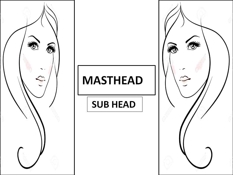
| These are the primary masthead inspirations that I have thought of for my magazine and ancillary products. Within my masthead, I have to include conventions and ideas that portray regional identity and the fashion genre. The idea of "NE Fashion" applies to both of these conventions, however, it seems vague and has no personality. Even though it looks professional and could work, I wanted my magazine to have more thought. I also was thinking about "On Point!" as it was quite a new, fresh and young term that would be undershorts by my target audience and was related with the fashion genre. However, it doeskin comprehend or relate with the regional side of my product, and may weaken the connection to my target audience. Finally, I decided with "lush!" as this is a commonly used term in the North East and definitely relates to appearance and fashion, as the terminology is used for these topics a lot up North. It also adds a but of fun and personality to my masthead which I wasn't primarily grasping in my other options. Overall, I believe that my final decision will be effective for my magazine and ancillary tasks, and will help me connect with my readers and allow me to go in deeper with regional identity further within my products. |
Time Management for December
1/12/15 - Start billboard
3/12/15 - Continue with billboard
8/12/15 - Start website
10/12/15 - Continue with website
15/12/15 - Continue with website
17/12/15 - Make finishing touches to ancillary products
3/12/15 - Continue with billboard
8/12/15 - Start website
10/12/15 - Continue with website
15/12/15 - Continue with website
17/12/15 - Make finishing touches to ancillary products
Tuesday, 8 December 2015
Time Management - 8/12/15
- Today I will continue on create my website as my billboard is complete.
- I will hopefully show my progress of my website on my blog.
Time Management Relfection - 5/12/15
- Today I have successfully created a first official draft of a billboard, while also supping back ups in case I change my mind later
- I also continued on from this by analyzing all the billboards I produced, as well as showing a comparison to a professional billboard.
Billboard Comparison
 |
 |
I decided to base mu billboard on Forever 21 's own billboard, as this brand revolves around the fashion genre, and would be significant to take inspiration from, as I am portraying the same ideas as this professional brand. The layout isn't exactly the same, however, I have focused more on mirroring the pose, as this is the main focal point of the billboard. Both of the models show similar poses and expressions, as shown by the position of their hands and facial expression. By recreating the look, my billboard will show professionalism and reliability of my own brand, and shows that consumers can trust my brand to portray the genre of fashion. As for the text, I have not took on the large masthead approach however, the subhead shown is quite similar to my own also. |
Billboard Drafts
I decided to make a few billboards, so that I have a clearer idea on what I wanted to portray, and so that I had options to pick the most professional and conventional board I produced. Below are the ones I have created.
 |
This is the first billboard I created. I chose this image as I thought it reflected the fashion genre by the use of costume, make-up and hair choice as they are all quite defined, and have been designed and chosen to fit the style of the magazine. However, it came across that the choice of pose made my model look unconfident due to the body language of the arms of my model. With this, I went on to design other options.
 |
This is another primary billboard I made, I wanted to try different options with the layout and placing of the images. I did like this billboard, however, I knew that I had better images at hand, and could create a better product with better images. |
 |
This is a billboard I produced after I received advice from my first billboards which I have talked about above. I knew for my second try I had to create a more confident approach so that the fashion genre could be reflected for the audience. I chose this picture as the model is open and is looking straight at the camera with quite a neutral expression to inspire professionalism and also fashion, as this pose is quite popular within real photo-shoots and the realm of the fashion industry. However, I decided to keep on designing to see if I could create a better product. |
 |
Again, this is another secondary billboard. I decided to try images of a different model, to see if this would change the overall effect. I took a similar layout to the one featured above, as it reflects my regional identity, due to the written content I have provided. I chose this image as my model shows a confident and fierce pose, and shows this through the hand on the hip pose, and the stern expression. Again, I kept designing to see which product would be the best. |
 |
| In the end, this is the billboard I chose overall. I chose this as I had the most positive feedback on this image and layout as it includes all the conventions that I included in previous billboards, and I have placed them so they look effective against the image. I chose this image in the end as it presented confidence and fashion so clearly that it was undeniable that I had to use it on the board. Also, the costume has more elements to the other outfits I have shown, which allows the billboard to relate more to fashion and my target audience. Again the hair and make-up help to create a dramatic effect, which is popular within fashion media. The expression of the model definitely assists this point, as she isn't focusing on the camera, but almost looking at her outfit which relates back to the fashion genre. The body language definitely portrays confidence compared to some previous billboards created. It is an open pose, which draws attention to the costume on the model, which can resemble further that my product is fashion based. |
Time Management - 5/12/15
- Today I will start manipulating images for my billboard, and create a few drafts to see which ones are my favourite
- Along with this, I will keep editing and creating my website
Thursday, 3 December 2015
Draft Comparison #2


I based my contents page on Vogue magazine, as this print is hugely influential and is iconic world wide. I also chose it as it large representation of fashion, and will give me my own ideas on content to include. I decided to mirror the layout of the page by organizing the text into different sections, to organise the page and to make it aesthetically pleasing for the consumer. My win image reflects the fashion genre and resembles youth and confidence due to the mise en scene of the confident smile and the pose. Again I might make some changes to fonts and alignments of the content I have provided, to try and get that professional look of vogue.
Draft Comparasion


In this post I will be presenting my draft against a proffessional print. I have converted colour schemes and particular fashion and model elements into my own product. I made sure my model wore black so that it would work with the layout an colour scheme, that matches the style of this cover ELLE. I also tried to alternate the fonts, however, looking back now, I know I want to make some changes to these, as I believe it will make it look more professional if I made them quite similar to each other, as this will match the house style, and give the magazine a fresh and professional look. Other than this, I believe that the image reflects the fashion industry and can relate with my young audience as I have chose a young model. Overall, I am considerably happy with my first effort, and I know the changes that I will make when coming to do my second official draft.
Time Management - 3/12/15
- Today I will reflect back on my magazines and make comparisons to existing products
- I will also get on with creating my website
- If I have time I will update my billboards
Tuesday, 1 December 2015
Time Management Reflection - 1/12/15
- I successfully produced two possible billboards as part of my ancillary tasks
- After I did this I continued with my website research and ams a decision of what direction of theme I want to go into
- I then started to add my own content and ideas in my website, which I will continue with next session.
Website Update

Website Drafts


These layouts on the Wix websites were my main options for my website. My original ideas were to go for the layout of the 'scarves wraps', however, with my house theme already in tact, the other theme proves to be better for my design and for my target audience as it resembles modern fashion and has a young fresh look, which I would prefer to take on
Billboard First Drafts


As part of my ancillary tasks, i have to create a billboard that supports my magazine and website. In this session, I have created two possible options and themes for my billboard. These billboards represent my fashion genre and relate with my target audience as I have used young models and colour layouts that would catch the eyes of my young female target audience.
Time Management - 1/12/15
- Today I am now leaving my magazine behind for now and going onto to my ancillary products
- I plan to make drafts of billboards so that I can get some inspiration and ideas
- Also I plan to start my website
Thursday, 26 November 2015
Time Management Reflection - 26/11/15
- Today I have successfully complete my front cover, and added all my written content that i needed to complete from the last session
- I also managed to improve my double page spread, and add some more images. However, my double page spread still needs to be completed, which I hope to achieve for the next session
Magazine Update

This is my finished magazine front cover, and therefore my official first draft. I have took inspiration from leading fashion magazine ELLE, as this fashion magazine is hugely popular worldwide. Also, I have added my regional content, so that it relates to the North East, and can be relatable to my chosen target audience. However, this is only my first draft, and I still have to make improvements to my product, so that it can be as professional as possible.
Time Management - 26/11/15
- Today I plan to finish my magazine front cover and add the conventions that I wish to include.
- After this, I intend to carry on with my double page spread and edit any images or content that needs to be edited for my page
Tuesday, 24 November 2015
Time Management Reflection - 24/11/15
- In this lesson I managed to do everything I planned to do. I successfully edited my image and added written content.
Magazine Update

This is currently where I am up to on my front cover. I have managed to edit my image effectively and add more written content to my page as planned. In my next session, I will hopefully go onto finishing this page and going on to finish my double page spread.
Time Management - 24/11/15
- Today I will advance on my front cover, and hopefully edit my dominant images and start to add cover lines and written content to the page
Time Management Reflection - 19/11/15
- In this lesson, I managed to start further on my front page
- I also advanced images for my double page spread
Time Management - 19/11/15
- Today I plan on starting my front page and possibly continue with my double page spread.
- Decide on layouts
Tuesday, 17 November 2015
Time Management Reflection - 17/11/15
- Today I managed to reflect on particular photoshop tools, and complete my analysis on them
- I also started to design and plan my double page spread by altering some of my images for the page
- Overall I have completed everything I needed to do today.
Magazine Update
I have begun to advance my double page spread and started to alter my pictures, so that they fit relevantly within my double page spread. Again, these are just early days and even though I have picked a layout, at the moment I am altering images and other content so that it looks professional on the page. Here is a picture of my current piece.

Photoshop Tools
While constructing my pages I have used Photoshop a great deal, to allow me to get the best out of my content in my magazine. These tools help me achieve a high quality effect to help me grasp a more professional piece.
One of the tools I used was the 'type tool' which allowed me to add any written content I wanted. This was extremely useful when I aged to accommodate any images or features with an explanation, and is also extremely conventional when thinking about the general needs of any print magazine. This has helped me hugely as without this tool, I would have not been able to add text in an easy and sufficient way without it looking as professional and effective as the 'type tool'.

The next tool I used was the 'spot healing brush tool'. This tool allowed me to fix any blemishes on my photos, and gave my images an air brushed and professional effect, which made my images more aesthetically pleasing. Without this tool, my images may have looked low quality and may have not fitted the style of the magazine.

I also used the 'background eraser tool' which allowed me to crop and delete sections of an image in an easy form. I used this when editing photos of beauty and fashion items, as it allowed me to only keep the image of the product itself, which made the image look professional on the pages of my magazine. Without this, my images would have looked extremely unprofessional, and would have not looked pleasing for a reader at all.

Another set of tools I used was the 'adjustment' tools. These allowed me to make changed to my images, like the contrast and concentration of the image. With these range of tools, I changed a variety of effects on my image. This improved my images, and gave them more of a 'magazine' look.

Time Management - 17/11/15
- Today I will reflect on what I have used in Photoshop and explain how its has helped me while constructing my magazine pages.
- After this, I will go on to creating my double page spread, and making a start on the layout of the general page and the altering of images I will use
Thursday, 12 November 2015
Time Management Reflection - 12/11/15
- Today I have completed everything I achieved to, and I am almost finished my contents page. This will allow me to go onto my front cover in my next session.
Magazine update

This is currently where I am up to on my contents page. I have added my cover surprise, and extra image, and more articles. I am almost finished my contents page, and only have to tweak it further until I get to my goal.
Time Management - 12/11/15
- This lesson I plan on continuing my contents page and get to the stage where I am almost finished.
Wednesday, 11 November 2015
Hair Inspirations

For my photos I need to resemble the nature of fashion, but also an autumn look to match my issue's subject. In this photo, I have included examples of particular hairstyles that I will be including and showing on my models. Using straight hair is classy and easy, and will allow readers to appreciate more simpler styles and allow them to be able to make a decoy look of their own.
Also the natural wave look familiarizes with the Autumn factor that I will be including in my magazine, therefore it would be effective as it almost completes a look.
Again, heated and more unnatural curls almost represents a more glamorous look, however, this indicates more of the fashion genre, and may come across to the reader as being professional and reliable for tips and tricks.
Overall, I will be using all these hairstyles within my work, and maybe even more, as within the fashion industry and culture, anything is possible and plausible.
Tuesday, 10 November 2015
Time Management Reflection - 10/11/15
- Today i was able to carry on with what I planned to get on with, which was my contents page for my magazine. I am now over half way through my page and hope to work on my other pages soon.
Magazine Update

This is currently where I am up to on my contents page of my regional fashion magazine. Since my last update I have added further articles within the page, while also adding page numbers. Another piece of content I added was my 'editors picks' section, which gives the reader an insight of the editors personal fashion favorites of the month. Overall, my progress is going well, and my contents page is soon to be complete.
Thursday, 5 November 2015
Time Management Reflection
- Today I have managed to do everything I needed to do and more.
- It was not in my plan to include/take images at this point, however, I have managed to take some and I have included them in my work straight away.
- After this I started on writing my article titles which I planned to do before hand.
- With this, I also managed to create an automatic colour and layout scheme, which has paved my way to developing my magazine further.
Magazine Update

This is where I am currently up to on my contents page of my regional fashion magazine: Lush!. I have created my layout and began a colour scheme. I am even above schedule as I have been able to take some pictures from an earlier photo-shoot. Also I have started my article content, which has helped me to start off my article set up scheme. Next session I will carry on with my articles.
Time Management - 5/11/15
- in this session I will carry on with my contents page, as I started this last lesson.
- I hope to start adding some written content, especially my articles sections
Tuesday, 3 November 2015
Time Management Reflection - 3/11/15
- I managed to get some details and plans on photo shoots
- I also started two pages of my magazines
Time Management For December
1/12/15 - Continue producing ancillary tasks
4/12/ 15 - Continue producing ancillary tasks
8/12/15 -Continue producing ancillary tasks
10/12/15 - Start to finish ancillary tasks and make sure you are completely happy with both the main tasks and the ancillary tasks.
14/12/15 - Finishing touches to all tasks
17/12/15 - Finishing touches to all tasks
Time Management For November
3/11/15 - Prepare to start magazine pages/ start each one as images not at hand
6/11/ 15 - Continue with magazines/ incorporate images if possible
10/11/ 15 - Continue with magazine pages/ create or decide a house colour theme/ include images
12/ 11/ 15 - Continue with magazine pages and content/ include images if possible
17/ 11/15 - All images should be sorted by this point/ keep going with magazine
20/11/15 - Do finishing touches to magazine
24/11/15 - Start ancillary tasks/ create billboard and website
26/11/15 - Continue with ancillary tasks
Monday, 26 October 2015
Font Ideas

For my fonts, I initially want a professional but fun look, as I want to resemble the fashion industry while still making it look professional. I also have to try and make it look considerably 'girly' to reach out to my target audience, which are women from ages 17 onward initially. These are my main fonts that i have decided may feature in my magazine. I have included various fonts that may fit as my masthead title, and I have also chose a few that resemble some of my planned articles that I will be featuring; like my autumn double page spread. I have also tried to include some basic font stat I will use for most of my body text, as this needs to be basic while also keeping it original and to fit the genre of the magazine and ancillary products.
Colour Scheme and Plans

When thinking about the colour scheme and layout of my magazine, I looked back on some original and professional covers to get some inspiration. I decided that colours on fashion covers consisted of light pastel colours, sided with basic but bold nude and monochrome shades. these together allow the magazine to be 'girly' but at the same time show matureness. I will take on this idea in my own magazine pages, as I believe that these two togethers individually and partnered are aesthetically pleasing and reflect the fashion genre and my target audience effectively.
Flat Plans and Rationales - Billboard
My billboard will be simple but original while also taking on a sleek and mature look, to represent the fashion genre I am taking on. I plan to feature two of the same image, and mirror them against each other on each side of the Billboard, and therefore feature the name of my magazine in the middle, and a slogan or subhead below. My billboard is subtle but it is definitely effective. I have taken inspiration from the Prada billboard, which was a huge success, and definitely had an impact. I will try to continue a house theme from my website and magazine to allow continuity and professionalism for my products. I believe that this will reach out to my target audience, especially by the image content, as this will resemble the fashion genre.
Extension/ Aftermath
My final billboard took on a slight different take than this original flat plan. The design that the images have a mirror effect still stayed for the final draft, as well as the central aligned text, however, they took on a slight different positions and layout. The main images weren't restrained by an outline or box but effectively stood freely, like the Forever21 billboard. The written content was still included but featured nearer the top of the board. I love my final draft, as I feel that it thorougly represents the fashion genre and links with the house theme of the rest of my products.

Flat Plans and Rationales - Website Beauty Page

In the Beauty page, I am featuring beauty, health and hair products, as this is a complete different sector to clothing, but still fits in with fashion and popular culture. Again, my magazine name will feature largely at the top of the page, to allow the reader to remember the magazine, and my other ancillary products. Website tabs are featured once again to allow the reader to browse amongst different areas of the website. I have created a 'Beauty Pick of The Day' segment, just to add a fun sense to the magazine, as it allows the reader to come back everyday and see different beauty items to their leisure. Next to this, I featured different areas for different articles and particular beauty products that my website will be reviewing. Below this, I have included a section where I display makeup tips, to allow the reader to appreciate the way the website can help them in some way. The websites house theme will carry out again onto this page, to keep a professional layout and colour scheme.
Extension/ Aftermath
When creating my beauty page, I went in a totally different direction, due to the fact that I did't like how the original layout looked on the page, so I tried something different. I believe this was a good decision. I still included the original content and ideas for articles and sell lines that I included in my flat plan, as these ideas were still effective and would be beneficial for the reader. Overall, I love the way that this page turned out, as it is original but is still effective and fresh, and still connotes the ideas of fashion.


Flat Plans and Rationales - Website Fashion Page

My second web link will consist of a archive of fashion topics, and what the magazine has wrote or featured about fashion. As the magazine is the fashion genre, a lot of the content on the website will be featured here. Again, like my other pages, the masthead/ name of the magazine, will feature at the top and will be quite large against the page, so that the reader will recognize my brand easily. Underneath, the website tabs will still remain, to allow the reader to go from page to page. Below, I have shown examples of what I will feature on my fashion page. I have added regional content by adding 'North East Favourites' to allow the reader to relate to my magazine and understand that it is local. These spaces will include various other topics on fashion, but the larger features will mirror the articles in my magazine. I have added a few examples of these articles and topics above in my flat plan. The color theme will almost replicate my other web page, to show professionalism and to make it a high quality product, as it is structured and laid out effectively.
Extension/ Aftermath
Through construction, I realised that this flat plan didn't support me enough to design the whole of my fashion webpage. However it did provide a starter and once I took on these first ideas I was confident enough to move forward. I added these first three boxes on the first sector of the page, then went onto creating new content, but kept the same topic of fashion. I am very pleased with how this turned out, as I included professional effects and made the whole page look effective with the content I added and manipulated on the page.


Sunday, 25 October 2015
Flat Plan and Rationales - Website Homepage

This is my plan for my magazines website homepage. As this is the homepage, it will house a range of different subjects, and will not only be one area as a homepage usually includes everything in some way. The name of my magazine will feature at the top of the web page, and will appear quite big, to allow the reader to notice the brand straight away, and for the homepage to look like a professional product. Below this will be the website tabs, this will link the consumer to a particular area of the website which includes articles and items of one significant topic or subject. I have shown in the picture above the kind of articles and features I will include on my homepage and website, as these ones I have chose randomly will fit my genre and be suitable for my target audience. Underneath the tabs, I plan to include an automatic scrolling article advertisement which will include various items that will be on the website. Finally, below this, will be links and descriptions of a range of articles that are included within the website. The house theme should hopefully mirror the look of the original magazine, but look professional and chic at the same time. Fonts and colours will also relate with my target audience, this being young women, and therefore look appealing to the eye with soft but bold colours, and mature fonts to go with it.
Extension/ Aftermath
My website did keep some elements of this flat plan, however, I did change some of the layout. I decided to do this as Wix offered me many effective designs and layouts, and the one that I liked best gave me a more effective layout than my flat plan did. However, saying this, I did keep some of my original ideas, like my sell lines and articles. I significantly added more images so that it would look more aesthetically pleasing to the viewer.


Subscribe to:
Posts (Atom)