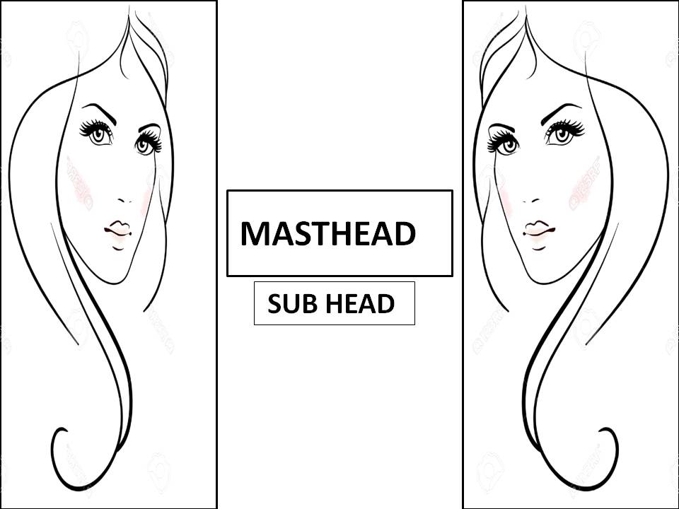
My billboard will be simple but original while also taking on a sleek and mature look, to represent the fashion genre I am taking on. I plan to feature two of the same image, and mirror them against each other on each side of the Billboard, and therefore feature the name of my magazine in the middle, and a slogan or subhead below. My billboard is subtle but it is definitely effective. I have taken inspiration from the Prada billboard, which was a huge success, and definitely had an impact. I will try to continue a house theme from my website and magazine to allow continuity and professionalism for my products. I believe that this will reach out to my target audience, especially by the image content, as this will resemble the fashion genre.
Extension/ Aftermath
My final billboard took on a slight different take than this original flat plan. The design that the images have a mirror effect still stayed for the final draft, as well as the central aligned text, however, they took on a slight different positions and layout. The main images weren't restrained by an outline or box but effectively stood freely, like the Forever21 billboard. The written content was still included but featured nearer the top of the board. I love my final draft, as I feel that it thorougly represents the fashion genre and links with the house theme of the rest of my products.

No comments:
Post a Comment