3/11/15 - Prepare to start magazine pages/ start each one as images not at hand
6/11/ 15 - Continue with magazines/ incorporate images if possible
10/11/ 15 - Continue with magazine pages/ create or decide a house colour theme/ include images
12/ 11/ 15 - Continue with magazine pages and content/ include images if possible
17/ 11/15 - All images should be sorted by this point/ keep going with magazine
20/11/15 - Do finishing touches to magazine
24/11/15 - Start ancillary tasks/ create billboard and website
26/11/15 - Continue with ancillary tasks
Tuesday, 3 November 2015

Monday, 26 October 2015
Font Ideas

For my fonts, I initially want a professional but fun look, as I want to resemble the fashion industry while still making it look professional. I also have to try and make it look considerably 'girly' to reach out to my target audience, which are women from ages 17 onward initially. These are my main fonts that i have decided may feature in my magazine. I have included various fonts that may fit as my masthead title, and I have also chose a few that resemble some of my planned articles that I will be featuring; like my autumn double page spread. I have also tried to include some basic font stat I will use for most of my body text, as this needs to be basic while also keeping it original and to fit the genre of the magazine and ancillary products.
Colour Scheme and Plans

When thinking about the colour scheme and layout of my magazine, I looked back on some original and professional covers to get some inspiration. I decided that colours on fashion covers consisted of light pastel colours, sided with basic but bold nude and monochrome shades. these together allow the magazine to be 'girly' but at the same time show matureness. I will take on this idea in my own magazine pages, as I believe that these two togethers individually and partnered are aesthetically pleasing and reflect the fashion genre and my target audience effectively.
Flat Plans and Rationales - Billboard
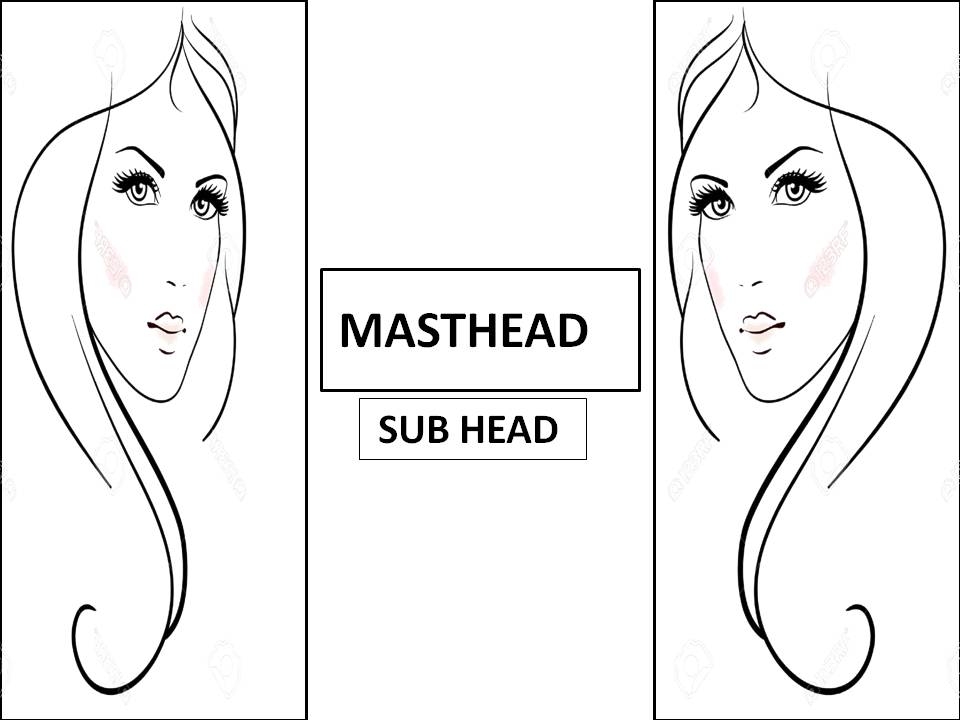
My billboard will be simple but original while also taking on a sleek and mature look, to represent the fashion genre I am taking on. I plan to feature two of the same image, and mirror them against each other on each side of the Billboard, and therefore feature the name of my magazine in the middle, and a slogan or subhead below. My billboard is subtle but it is definitely effective. I have taken inspiration from the Prada billboard, which was a huge success, and definitely had an impact. I will try to continue a house theme from my website and magazine to allow continuity and professionalism for my products. I believe that this will reach out to my target audience, especially by the image content, as this will resemble the fashion genre.
Extension/ Aftermath
My final billboard took on a slight different take than this original flat plan. The design that the images have a mirror effect still stayed for the final draft, as well as the central aligned text, however, they took on a slight different positions and layout. The main images weren't restrained by an outline or box but effectively stood freely, like the Forever21 billboard. The written content was still included but featured nearer the top of the board. I love my final draft, as I feel that it thorougly represents the fashion genre and links with the house theme of the rest of my products.

Flat Plans and Rationales - Website Beauty Page

In the Beauty page, I am featuring beauty, health and hair products, as this is a complete different sector to clothing, but still fits in with fashion and popular culture. Again, my magazine name will feature largely at the top of the page, to allow the reader to remember the magazine, and my other ancillary products. Website tabs are featured once again to allow the reader to browse amongst different areas of the website. I have created a 'Beauty Pick of The Day' segment, just to add a fun sense to the magazine, as it allows the reader to come back everyday and see different beauty items to their leisure. Next to this, I featured different areas for different articles and particular beauty products that my website will be reviewing. Below this, I have included a section where I display makeup tips, to allow the reader to appreciate the way the website can help them in some way. The websites house theme will carry out again onto this page, to keep a professional layout and colour scheme.
Extension/ Aftermath
When creating my beauty page, I went in a totally different direction, due to the fact that I did't like how the original layout looked on the page, so I tried something different. I believe this was a good decision. I still included the original content and ideas for articles and sell lines that I included in my flat plan, as these ideas were still effective and would be beneficial for the reader. Overall, I love the way that this page turned out, as it is original but is still effective and fresh, and still connotes the ideas of fashion.


Flat Plans and Rationales - Website Fashion Page

My second web link will consist of a archive of fashion topics, and what the magazine has wrote or featured about fashion. As the magazine is the fashion genre, a lot of the content on the website will be featured here. Again, like my other pages, the masthead/ name of the magazine, will feature at the top and will be quite large against the page, so that the reader will recognize my brand easily. Underneath, the website tabs will still remain, to allow the reader to go from page to page. Below, I have shown examples of what I will feature on my fashion page. I have added regional content by adding 'North East Favourites' to allow the reader to relate to my magazine and understand that it is local. These spaces will include various other topics on fashion, but the larger features will mirror the articles in my magazine. I have added a few examples of these articles and topics above in my flat plan. The color theme will almost replicate my other web page, to show professionalism and to make it a high quality product, as it is structured and laid out effectively.
Extension/ Aftermath
Through construction, I realised that this flat plan didn't support me enough to design the whole of my fashion webpage. However it did provide a starter and once I took on these first ideas I was confident enough to move forward. I added these first three boxes on the first sector of the page, then went onto creating new content, but kept the same topic of fashion. I am very pleased with how this turned out, as I included professional effects and made the whole page look effective with the content I added and manipulated on the page.


Sunday, 25 October 2015
Flat Plan and Rationales - Website Homepage

This is my plan for my magazines website homepage. As this is the homepage, it will house a range of different subjects, and will not only be one area as a homepage usually includes everything in some way. The name of my magazine will feature at the top of the web page, and will appear quite big, to allow the reader to notice the brand straight away, and for the homepage to look like a professional product. Below this will be the website tabs, this will link the consumer to a particular area of the website which includes articles and items of one significant topic or subject. I have shown in the picture above the kind of articles and features I will include on my homepage and website, as these ones I have chose randomly will fit my genre and be suitable for my target audience. Underneath the tabs, I plan to include an automatic scrolling article advertisement which will include various items that will be on the website. Finally, below this, will be links and descriptions of a range of articles that are included within the website. The house theme should hopefully mirror the look of the original magazine, but look professional and chic at the same time. Fonts and colours will also relate with my target audience, this being young women, and therefore look appealing to the eye with soft but bold colours, and mature fonts to go with it.
Extension/ Aftermath
My website did keep some elements of this flat plan, however, I did change some of the layout. I decided to do this as Wix offered me many effective designs and layouts, and the one that I liked best gave me a more effective layout than my flat plan did. However, saying this, I did keep some of my original ideas, like my sell lines and articles. I significantly added more images so that it would look more aesthetically pleasing to the viewer.


Subscribe to:
Posts (Atom)